How to Get Postable Pictures for Your Brand (without doing a photoshoot!)
In today’s post we’re going to cover how to get fresh, postable photos for your brand as soon as TODAY, without having to take any new pictures (because sometimes, we just need to give ourselves a little break from taking new photos, and get creative with how we can stretch, repurpose, & utilize content we’ve already created) Sound good? Watch the video below (or if you’d prefer to read - keep scrolling!).
GO THROUGH YOUR PHOTO LIBRARIES & REVIEW YOUR OUTTAKES
The first thing I want you to do is go through your photo libraries and find a picture you haven’t posted before. For me, these are usually photos I previously considered to be “outtakes” - meaning, it wasn’t the main picture I was going for at the time, it was more of an in-between moment (which by the way, an easy way to always get extra photos in your sessions is ask your photographer, friend or whoever is taking photos for you, to keep shooting between shots to get some extra photos at your session).
Here’s an example of a photo I found by going through some old photos. The photo of the left is the one I was originally going for (and the one I posted), but the photo on the right was also taken within a few minutes of taking the other photo, but I never posted it:
The photo on the right may not feel new to me, but it would feel super fresh to my audience if I were to post it because they’ve never seen it before!
If you haven’t had any brand photoshoots, or if you have and you’re not finding any fresh-looking content there, you can utilize this same concept by scrolling through your phone’s camera roll and finding some personal or behind-the-scenes photos you haven’t shared before.
Looking through your photos with a fresh set of eyes is SO valuable. Just like sometimes you might start liking a sweater that’s been in the back of your closet that previously felt kinda “meh” to you for a season, you might find some photos you’ve already invested time, money, or creative energy in that weren’t quite right before, but are PERFECT to use now. Revisiting your photo libraries could be all it takes for you to find a fresh, postable photo today. Just browse and wait for something to catch your eye - and if you find something you like, but it’s not 100% what you’re going for, or if you can only find photos you’ve already posted, that’s totally okay -- I’m about to share 3 ways you can edit or alter photos you’ve already taken to turn them into some fresh content for your brand.
How to Edit or Alter Photos You’ve Already Taken to Turn Them into Fresh Content for Your Brand:
Way #1: change the perspectIve
The first way you can turn an old photo into fresh content for your brand is to change the perspective. What I mean by perspective is the point of view the audience is seeing the photo from. The perspective can easily be changed by rotating the photo, cropping it, or both! Changing the perspective of your photo transforms it into something totally new!
Cropping is essentially cutting your photo, (I like to think of it like a cookie cutter for your photos). It’s a great tool to help your viewers focus on a totally different part of the picture than they did before by cutting out portions of the photo. Rotating your photo is exactly what it sounds like, it’s just turning your photo. When you rotate your photo, whether a little, or a lot, it can let viewers see your photo from a whole new perspective. So, experiment with cropping, rotating, (or both!) until your original photo looks brand new!
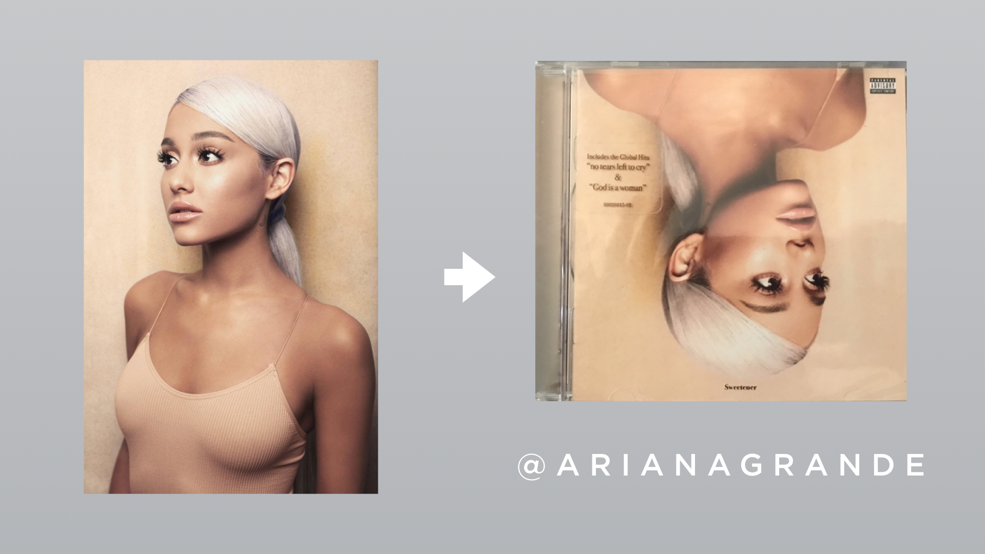
When I was thinking about cropping and rotating for this video, what kept popping in my mind was Ariana Grande’s Sweetener Album Cover art - I don’t know if you’ve seen it or not, so I had to pull it to show it to you because she did both of these things. On the left (below) is the original photo, and on the right she had her photo cropped and rotated to make into something REALLY show-stopping and brand new.
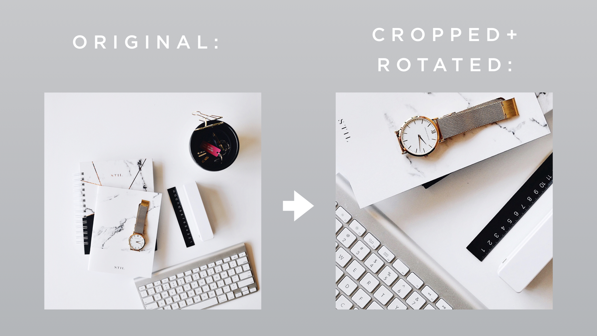
In case that example is too far out there for your brand, I also pulled an example of something a little more subtle to show ya. On the left (below) is the original photo, and on the right is the new photo created by cropping and rotating to change the perspective.
If you use this strategy to stretch your brand content further, just make sure your photo is high enough in resolution that when you’re cropping it, it doesn’t look blurry or grainy, alright?!😊 (I’m such a stickler on this!)
Way #2: Edit the Colors
The second way you can turn an old photo into fresh content for your brand is by editing the colors. Sometimes, I skip over posting certain photos because the colors don’t fit with my brand’s color palette. But, there’s actually a fix for this and it’s really easy to do and helps me get a lot more out of my brand photos.
What I do is use the app “Darkroom” to remove tones of colors that are throwing off the color vibe I’m going for. Here’s the app: Darkroom
Here’s how I do it:
After I open the app and pick the photo I’m going to edit, I click on the three overlapping circles on the menu bar at the bottom.
Then, I tap on which hue I want to remove from my photo.
Then, I decrease the saturation of that hue by sliding the circle on the saturation bar to the left, usually all the way so that hue is no longer in that photo.
Just keep in mind that you may need to remove the saturation from multiple hues in the same color family to get the result you’re going for.
Way #3: Add an Overlay
The third way to turn an old photo into fresh content for your brand is to add an overlay. What I mean by overlay is to literally lay something over the photo. This could be a brand color, words, or both! My favorite program to do this in is Canva. I’m going to show you how to add an overlay to your photo in Canva on Canva’s desktop version.
Once you’re logged in, click on “Create a Design”, then, click on “Instagram Post” in the dropdown menu.
Once it all loads, you can drag and drop your photo from your desktop onto the white space, then drag the corners of your photo to resize it to fill the entire white space.
Next, click on “Elements” on the left-hand side.
Then, click on the square to add it to your design. This will be your overlay, but we’re going to change it to make it look really good.
If you’d like to change the color of the overlay to one of your brand colors, click on the color block in the upper menu bar, then click on one of the colors available, or click on the “plus sign” to choose a custom color.
Once you have your color selected, make your square transparent by clicking on the icon that features a gradient on the right-hand side of the upper menu bar. Slide the transparency to the left until the desired effect is acheived.
Then, stretch the square to cover the whole photo.
Next, if you’d like to add text over your photo, click “text” on the left hand side. Then, click on a style you like to add it over top of your photo.
Adjust the size, colors, and change the text to say what you’d like it to say. (Remember, if you’d like just a text overlay without the color overlay, you could delete the colored square, or just do the second part I showed you and don’t add the square at all. Play around with it and see what works for your brand and the particular photo you’re working with.)
Once you’re happy with the way it looks, click the “download” button in the upper right hand corner, choose the file type, then click the “download” button below that to download your file.
And that’s it! By scouring for photos you haven’t posted before, or even using photos you have posted and altering them in one or all of the ways I showed you, you can stretch your content further and buy yourself a little extra time in between photoshoots
I hope you liked this post - if you plan on trying any of the options I shared with you leave a comment below and let me know which one. And, if you’d like to keep up with the videos I create on how to improve your brand and grow your business be sure to subscribe to my YouTube channel - I would appreciate it very much!
One more thing - I have a free PDF download I think you’ll like called “My 4 Favorite Editing Apps” where I go through which apps they are, where to find them, and what I use them for - I already introduced you to one of them today, which is Darkroom, but if you’d like to know what the other 3 are, there’s a click on the graphic below, enter the email address you’d like me to send it to, and you’ll get instant access!
Alright guys that’s everything for today! Hope you have a great week and I hope to see you again very very soon but until then, you can catch me on Instagram @sarahdeshaw! See you guys later!


